
Spotify’s New Logo Moment: Branding Win or Internet Meltdown?
To celebrate its 20th anniversary, Spotify has launched a 20-day campaign highlighting major user data moments, from the most-streamed song of all time to the ultimate breakup anthem. Along with this nostalgic celebration, the music streaming giant has also introduced a refreshed app icon.

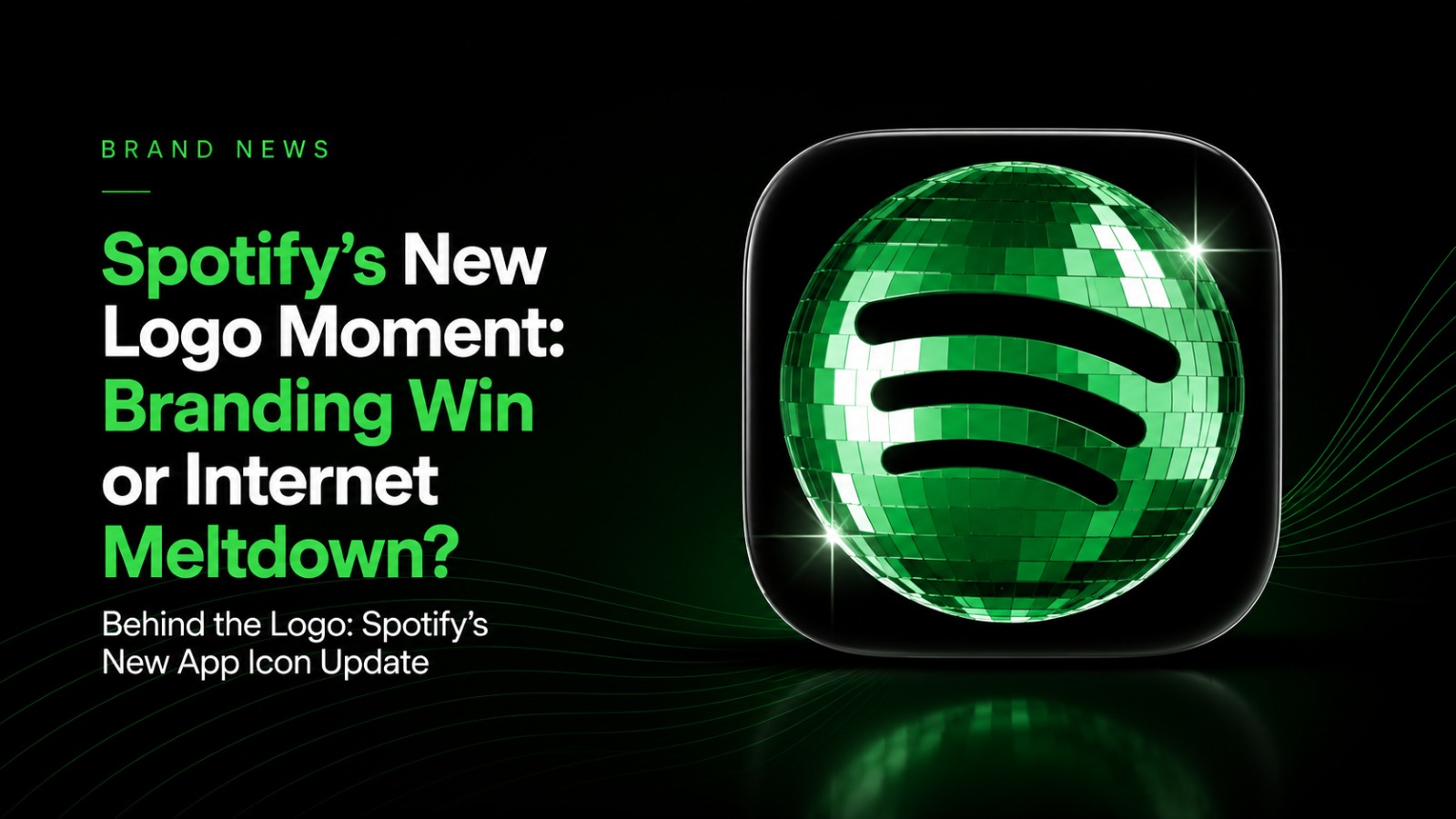
Behind the Logo: Spotify’s New App Icon Update
To celebrate its 20th anniversary, Spotify has launched a 20-day campaign highlighting major user data moments, from the most-streamed song of all time to the ultimate breakup anthem. Along with this nostalgic celebration, the music streaming giant has also introduced a refreshed app icon.
Spotify’s logo is one of the most recognisable symbols in the entertainment and music streaming world. So, when the new icon appeared, it naturally caught users’ attention. While some welcomed the fresh look, others were quick to express their disappointment online, proving once again that even the smallest brand changes can create a big reaction.
However, the updated design appears to be part of the anniversary campaign rather than a permanent rebrand. Still, the response shows how deeply users connect with familiar brand identities — especially when it comes to a logo as iconic as Spotify’s.
Discussion
No comments yet. Be the first to share your thoughts!