
Google Maps Gets a New Look: The Icon Enters Its Gradient Era
Google Maps, one of the most familiar app icons on our phones, is getting a fresh redesign. The iconic location pin is still there, but Google has now given it a softer, more modern gradient treatment across Android and iOS. The update keeps the brand instantly recognizable while aligning it with Google’s newer AI-inspired visual language.

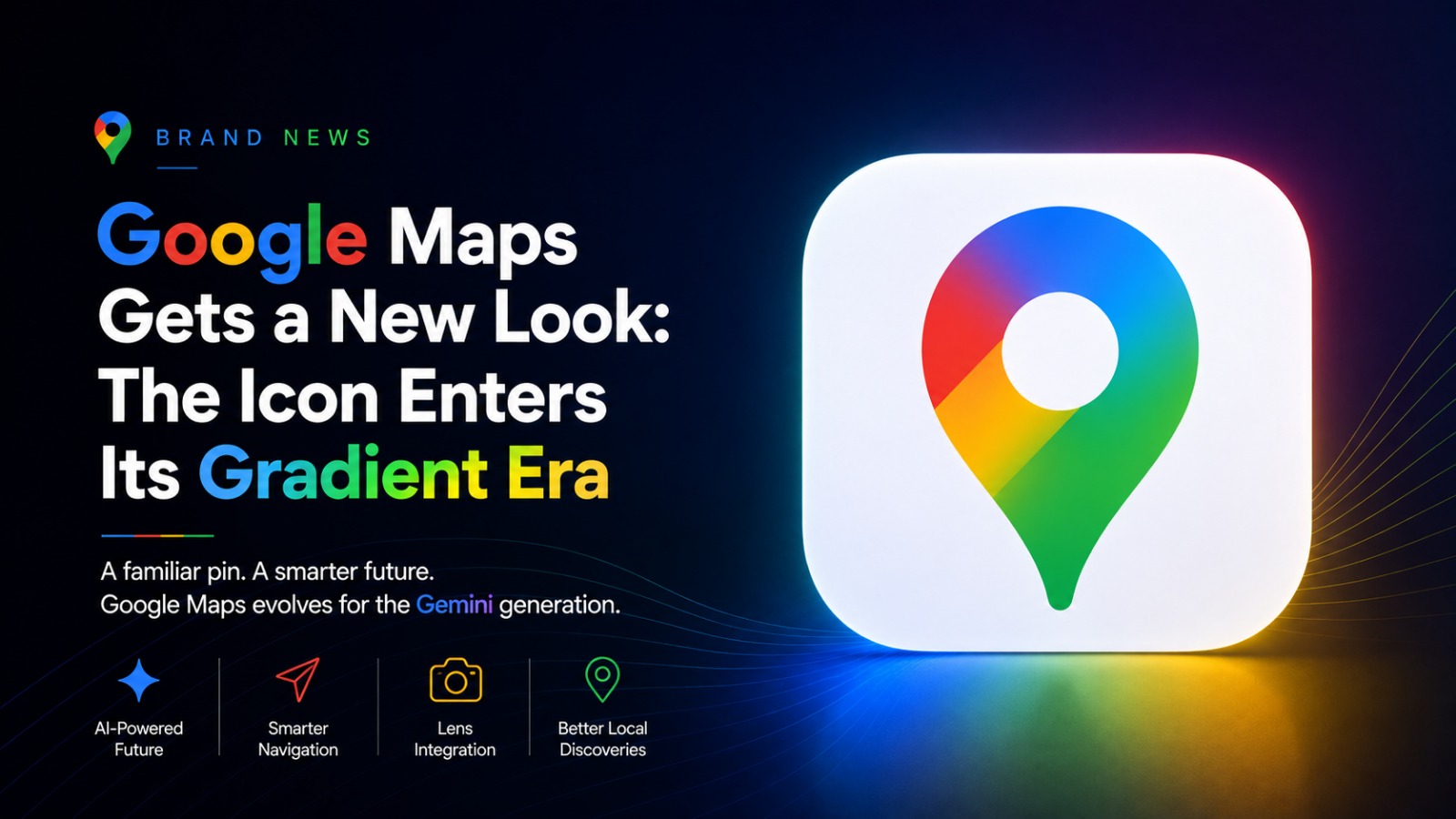
A Familiar Pin, But Sharper and Cleaner
The new Google Maps icon does not completely reinvent the brand. Instead, it refines it. The pin shape remains the hero, but the proportions have changed. The top ring is thinner, the inner circle is larger, and the overall form feels cleaner and more digital-first.
This is the kind of redesign that may look small at first glance, but it signals a larger shift in Google’s design direction.
Goodbye Flat Color Blocks, Hello AI Gradient
Earlier, the Google Maps icon used clear diagonal partitions in Google’s four signature colors. The new version removes those sharp separations and replaces them with a smoother gradient inspired by Google’s Gemini and AI design language.
This gives the icon a softer, more fluid feel. It also makes Google Maps visually match the newer look seen across Google products like Photos, Home, Gemini, and Search.
Why This Redesign Matters
Google Maps is no longer just a navigation app. It is slowly becoming an AI-powered local discovery and travel assistant. Recent updates have added Gemini-powered features, including conversational navigation, traffic reporting, Lens integration in Maps, and smarter listing insights like “Know before you go.”
So the new icon is not just cosmetic. It reflects where Google Maps is heading: more intelligent, more interactive, and more deeply connected to AI.
Rolling Out on Android and iOS
The redesigned Google Maps icon is rolling out with version 26.09.06.873668274 on Android, while iOS users are getting it with version 26.09.5.
The Bigger Picture
Some users may take time to adjust to the new look, especially because the older Google Maps icon was so familiar. But from a branding perspective, this redesign makes sense. It keeps the emotional memory of the original pin while bringing it into Google’s current AI-led visual system.
Google Maps has not lost its identity. It has simply evolved for the Gemini generation.
Discussion
No comments yet. Be the first to share your thoughts!